Analyzing my electricity consumption
Electricity prices have been steadily rising in France for the past few years, with a particularly sharp increase since the beginning of the Russian invasion of Ukraine. This has led me to wonder about my own electricity consumption and how I could optimize it.
The hardware
Since 2015, the organization managing the national French power grid (Enedis) has been in the process of replacing the legacy “dumb” electricity meters by “smart” meters, known under the brand name “Linky”. This process hasn’t been without controversy, with some people fearing that the new meters would fry their brain using Bill Gates’ evil 5G Wi-Fi waves, as is common in France. I, however, was quite excited about the prospect of having access to my electricity consumption data in real time.
The new meters look like this:
Phenomenal design, but one must not judge a book by its cover.
There’s not much you can do by directly accessing the meter; the two buttons are only used to scroll through all the data it can display, such as the instantaneous apparent power (measured in VA) or the total energy consumption (measured in kWh). There is a communications port on the front that can be used to read the data in real time (which is a nice thought!), so you can get things like this:
However, this is not required to get the data we want. If enabled in your contract, the daily consumption data (divided in 30min slices) will be sent to Enedis, and will be available to you through their website.
Getting the data out
Consumption data
Enedis’ website is nice, you get pretty usage charts with filters and all, but what I want is to get the raw data and process it. There’s an export feature that allows you to download the data in CSV format, but it’s not very convenient. I’d really like to get the data automatically, without having to log in to the website every day.
Luckily, Enedis provides an API for that. Unluckily, it’s quite difficult to use it, since as with most French public APIs you need to be a registered professional to get access. Luckily again, someone already did the hard work for me: a “wrapper” API called MyElectricalData.
Here’s an example:
1
2
3
4
curl -X 'GET' \
  'https://www.myelectricaldata.fr/consumption_load_curve/$MY_METER_ID/start/2024-02-01/end/2024-02-02/cache' \
  -H 'accept: application/json' \
  -H 'Authorization: $MY_TOKEN'
1
2
3
4
5
6
7
8
9
10
11
12
13
14
15
16
17
18
19
20
21
22
23
24
25
26
27
28
29
30
31
32
33
34
35
36
37
38
39
40
41
42
43
44
45
46
{
  "meter_reading": {
    "usage_point_id": "$MY_METER_ID",
    "start": "2024-02-01",
    "end": "2024-02-02",
    "quality": "BRUT",
    "reading_type": {
      "measurement_kind": "power",
      "unit": "W",
      "aggregate": "average"
    },
    "interval_reading": [
      {
        "value": "1258",
        "date": "2024-02-01 00:30:00",
        "interval_length": "PT30M",
        "measure_type": "B"
      },
      {
        "value": "732",
        "date": "2024-02-01 01:00:00",
        "interval_length": "PT30M",
        "measure_type": "B"
      },
      {
        "value": "620",
        "date": "2024-02-01 01:30:00",
        "interval_length": "PT30M",
        "measure_type": "B"
      },
      // ...
      {
        "value": "3126",
        "date": "2024-02-01 23:30:00",
        "interval_length": "PT30M",
        "measure_type": "B"
      },
      {
        "value": "3182",
        "date": "2024-02-02 00:00:00",
        "interval_length": "PT30M",
        "measure_type": "B"
      }
    ]
  }
}
Each 30min slice of the day is a JSON object identified by the slice’s end: "2024-02-01 00:30:00" is the slice corresponding to the time slice 00:00 to 00:30 on February 1st. The value can be understood as an energy measured in “Watt-half-hours”, so for example the first slice here has 1258 “W30min”, which means 629 Wh were consumed during that half-hour. Since Wh is the unit used for pricing, all the values will be halved before further processing.
Pricing data
Knowing how many watt-hours I consumed is nice, but I’d also like to know how much it cost me. The price of electricity changes regularly here, but for the public provider (EDF), the prices are fixed by the government (those are called “regulated prices”). This usually guarantees stabler prices than private providers (which have “market prices”).
There’s a really nice website in France called data.gouv.fr that hosts a large number of public datasets, including the regulated electricity prices. The data is usually updated as soon as the prices change, and is available in CSV format.
Electricity pricing in France
As an aside, I’d like to explain a bit how electricity is usually priced in France. The price is composed of two parts: a fixed part (the “subscription”) which is defined per month or per year, and a variable part (the “consumption”) which depends on how much energy you used during a pricing period. The variable part is measured in €/kWh (or, more realistically in ¢/kWh).
On top of this logic, there are multiple systems for defining “pricing periods”.
The most basic system is the “Base” system, where electricity costs the same all the time.
The other simple system is called “Peak Hours”, and it defines a “Peak” period during the day (16 hours long, usually 06:00 to 22:00) and an “Off-Peak” period (8 hours long, usually 22:00 to 06:00). The price is higher during the Peak period than during the Off-Peak period. In the end, in terms of €/kWh, Peak > Base > Off-Peak. Most power-hungry equipments support some kind of automatic scheduling to take advantage of this; water heaters for example are usually set to start at 22:00 and do their best to not run during the peak hours. A signal is sent over the power grid to signal the start of the non-peak hours. If used properly, this system can save a lot of money, in the order of hundred of euros per year.
Another more recent system is called “Tempo”, where the day is divided in peak and non-peak hours as in the previous system, but the year is additionally divided in three “seasons” (which need not be contiguous): Red, White and Blue. The Red days are very expensive, while the White days are less expensive than Base, and the Blue days even less. The color of each day is usually known a few days in advance, but the number of days of each color is fixed. For example, there can only be 22 Red days during the year (and only during the winter months). In the end, you get PeakRed » Base > PeakWhite > PeakBlue > NonPeakRed > NonPeakWhite > NonPeakBlue.
Here’s the history of Tempo days for the year 2022 so you can see what I mean:
| 1 | 2 | 3 | 4 | 5 | 6 | 7 | 8 | 9 | 10 | 11 | 12 | 13 | 14 | 15 | 16 | 17 | 18 | 19 | 20 | 21 | 22 | 23 | 24 | 25 | 26 | 27 | 28 | 29 | 30 | 31 | ||
|---|---|---|---|---|---|---|---|---|---|---|---|---|---|---|---|---|---|---|---|---|---|---|---|---|---|---|---|---|---|---|---|---|
| Jan | ||||||||||||||||||||||||||||||||
| Feb | ||||||||||||||||||||||||||||||||
| Mar | ||||||||||||||||||||||||||||||||
| Apr | ||||||||||||||||||||||||||||||||
| May | ||||||||||||||||||||||||||||||||
| Jun | ||||||||||||||||||||||||||||||||
| Jul | ||||||||||||||||||||||||||||||||
| Aug | ||||||||||||||||||||||||||||||||
| Sep | ||||||||||||||||||||||||||||||||
| Oct | ||||||||||||||||||||||||||||||||
| Nov | ||||||||||||||||||||||||||||||||
| Dec | ||||||||||||||||||||||||||||||||
And, as a reference, here are the prices as of 2024-02-15:
| Plan | Period | Peak (¢/kWh) | Off-Peak (¢/kWh) |
|---|---|---|---|
| Base | 25,16 | 25,16 | |
| Peak | 27,00 | 20,68 | |
| Tempo | Blue | 16,09 | 12,96 |
| White | 18,94 | 14,86 | |
| Red | 75,62 | 15,68 | |
At first glance, it would seem that the Tempo plan is better than all the other ones (by doing an average of the prices weighted by their period), but there is actually a reason for it to exist: the power grid is under a lot of stress during the Winter, because people need to, well, heat their homes.
The biggest part of continental France is used to cold temperatures in the Winter, so for most people, having electricity heating makes Tempo the most expensive plan. However, for people who heat their homes with gas or wood, or who live in the South, like me, it can be a good deal. A very good deal, actually.
Doing something with it
I wrote a small Python web app using NiceGUI (the same I used for PlexDLWeb, because it’s really nice) that:
- fetches the data from Enedis through MyElectricalData
- fetches the electricity prices from various sources
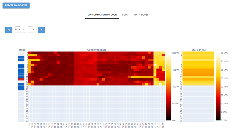
- displays everything in nice heatmaps
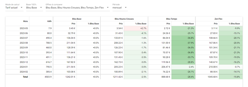
- compares all the available plans to make sure I’m on the cheapest one
The consumption data is refreshed each day during the night, so the data for day N is usually available from Enedis on day N+1 in the early morning (01:00-02:00).
Storing the data
The API returns the day for each day as JSON, so it’s a bit heavier than a CSV export. It’s not viable to fetch the entire consumption history at each program start; this is an app I plan on using every other day to track my consumption.
My first prototype used pickle to serialize a big ol’ dictionary, but I quickly switched to SQLite when I realized how much data I was going to have to store.
For each day, there are 48 30min slices, so 17520 slices for each year. For each slice, I want to also compute the price for each plan. That’s a lot of for-eaches (?). Relational databases are good for join-ing multiple sets of data together (see what I did there?).
My schema looks like this:
1
2
3
4
5
6
7
8
9
10
11
12
13
14
15
16
17
CREATE TABLE consumption (
    year INTEGER, month INTEGER, day INTEGER,
    slice INTEGER CHECK (slice BETWEEN 0 AND 47),
    value INTEGER,
    PRIMARY KEY (year, month, day, slice)
);

CREATE TABLE plan_slice (
    plan_id TEXT,                   -- "base", "peak", "tempo", ...
    power INTEGER,                  -- subscription power (3, 6, 9, ... kVA)
    day_kind INTEGER,               -- 0 (all days), 1, 2, 3 (Tempo days)
    start TEXT,                     -- start of pricing period
    end TEXT,                       -- end of pricing period
    subscription INTEGER,           -- subscription price in €/100
    kwh_hp INTEGER, kwh_hc INTEGER, -- price for peak and non-peak, in €/1000
    PRIMARY KEY (plan_id, power, day_kind, start)
);
I won’t show the SQL queries used to compute the displayed data, because, frankly, it’s ugly, but it’s generated on the fly depending on the UI inputs and selected plans, and it’s quite fast.
Displaying it
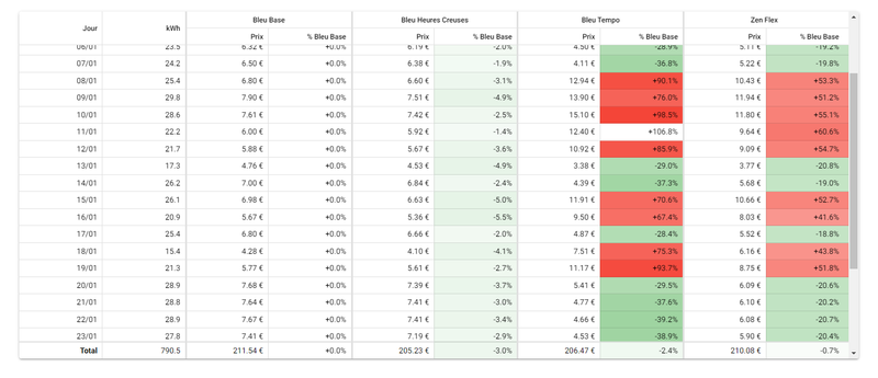
As predicted before, the Tempo plan is the cheapest for me, having saved me more than 300 euros during the past ten months. Even during the month of January where I actually had to turn on my electric heaters for a few days, and where there were a lot of Red days, it was still cheaper than the Base plan for the whole month, because the Blue and White days completely compensated the Red ones:
Conclusion
NiceGUI is really, really nice for building web apps in Python. Actually, since it has a native mode, it can also be used as a pretty good cross-platform desktop app framewkork, like Electron, but with Python. The built-in components are good, and there are escape hatches to use native Quasar features when needed (had to do that quite a lot for the price table with styling and all).
SQLite is also ergonomic to use for simple cases such as mine here.
As always, code is on GitHub.
For French readers who’d like to make the most of their money, there’s a neat OSS tool dedicated to comparing all the electricity subscription plans available in France (spoiler: Tempo beats everything, by far), called comparateur-abonnements-electricite (code here). It runs on CSV exports and computes the total price you’d have paid with each plan. It has more plans than my tool, but mine is more focused towards day-to-day consumption analysis, the pricing part is just a bonus.
Thanks for reading.

 Front view of the Linky meter. It's a green rectangular plastic box, 20cm wide and 12cm tall, with a small text display and two navigation buttons in the middle.](https://zdimension.fr/generated/assets/posts/2024-02-16-analyzing-my-electricity-consumption/Linky-800-e697c18ab.jpeg)
 Close shot of a Linky meter with a small device plugged into the communications port.](https://zdimension.fr/generated/assets/posts/2024-02-16-analyzing-my-electricity-consumption/titre-lixee-xlinky-zigbee-teleinfo-1-copie-800-4ffff56bf.webp)


